About us
Introducing Realtime: continuous, automated analysis of public data
Introducing Realtime: continuous, automated analysis of public data
By Matthew Conlen and Harsha Panduranga
Published February 13, 2024
About us
Harsha is an attorney and public policy researcher who pushes for decision-making that is driven by accurate data and credible social science methods, rather than popular impulses.
Staying informed takes time. And with so many things vying for our attention, it’s difficult to figure out how best to allocate it—how to differentiate sensationalism from balanced analysis, and how to determine whether the content elevated to the top of a social media feed or the front page of a newspaper truly reflects what most merits our attention and the reality of the world around us.
We all know the feeling: consuming a lot—occasionally getting a kick out of it, occasionally learning something useful—but at the same time being unsure that we’re overall better informed.
Our vision for Realtime is a platform that makes data the connective tissue between various mediums of public discourse.
Here’s how it works. The Realtime engine continuously tracks and detects key changes within public data on a range of topics: economics, finance, industry, politics, sports, environment, media, local government activities, and others. It then uses AI to generate live updating visualizations and reports that combine observations about the data with news reports that may give context for what is being observed.
As of today, we’ve released the initial beta version of Realtime for anyone to use. Subscribers who sign up during the beta period will have access to discounted pricing on current and future features. In turn, we ask only for your patience and honest feedback.
One of our goals is for Realtime to serve as a counterweight—but not a replacement—to balance the impact of the emotional appeals that define media and political discourse today. We’re still experimenting, but the aim is eventually to build a reliable bidirectional system: one that both provides real-time, data-driven background for ongoing phenomena and flags previously unnoticed developments that, based on the data, merit further investigation.
Why do we need Realtime?
Why do we need Realtime?
Anchoring public narratives
Anchoring public narratives
Data offers a point of reference for issues that are important to voters and public officials. Take public safety. Like most issues, skimming what’s surfaced on our news and social media feeds can’t always give us a fully informed view on ongoing developments.
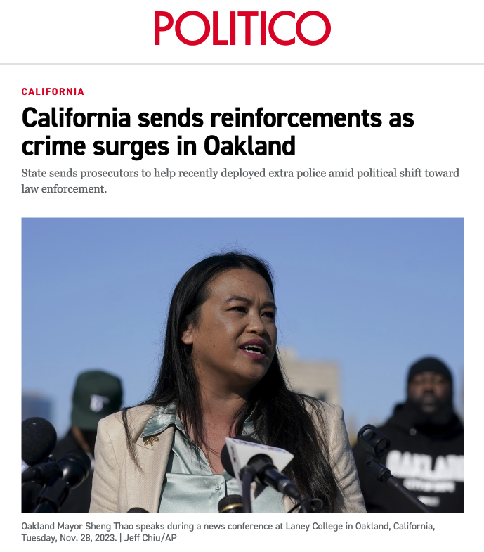
The article shown in Figure 1 describes “surging violent” crime in Oakland, even as the police department’s own data shows a minimal uptick in the offenses that comprise violent crime. The reality is nuanced: while the number of robberies have increased since last year, most types of violent crime have decreased over that same period. Timely empirical evidence can help to ground public discourse and support effective policymaking.
Examples of this type are common. The mismatch between the perception and reality of COVID-19 transmission rates—potentially related to waning media coverage of the virus—informs how people take measures to protect their health. The asymmetry between how people are feeling about their economic prospects and what traditional indicators of economic health show should spur policymakers to examine whether they’re measuring the right thing, or what might explain the difference. And so on.
Tracking data over time
Tracking data over time
Data that’s relevant to our interests is scattered across the internet. Checking presidential election forecasts after the latest economic estimates before researching who to start in your fantasy sports lineup means checking at least three different websites every time.
You can generally find the data displayed on Realtime online. But our engine reduces barriers to finding and keeping track of it. The data on Realtime is centralized, searchable, and continuously updating, but also comes to you in an email containing the top data-driven stories.
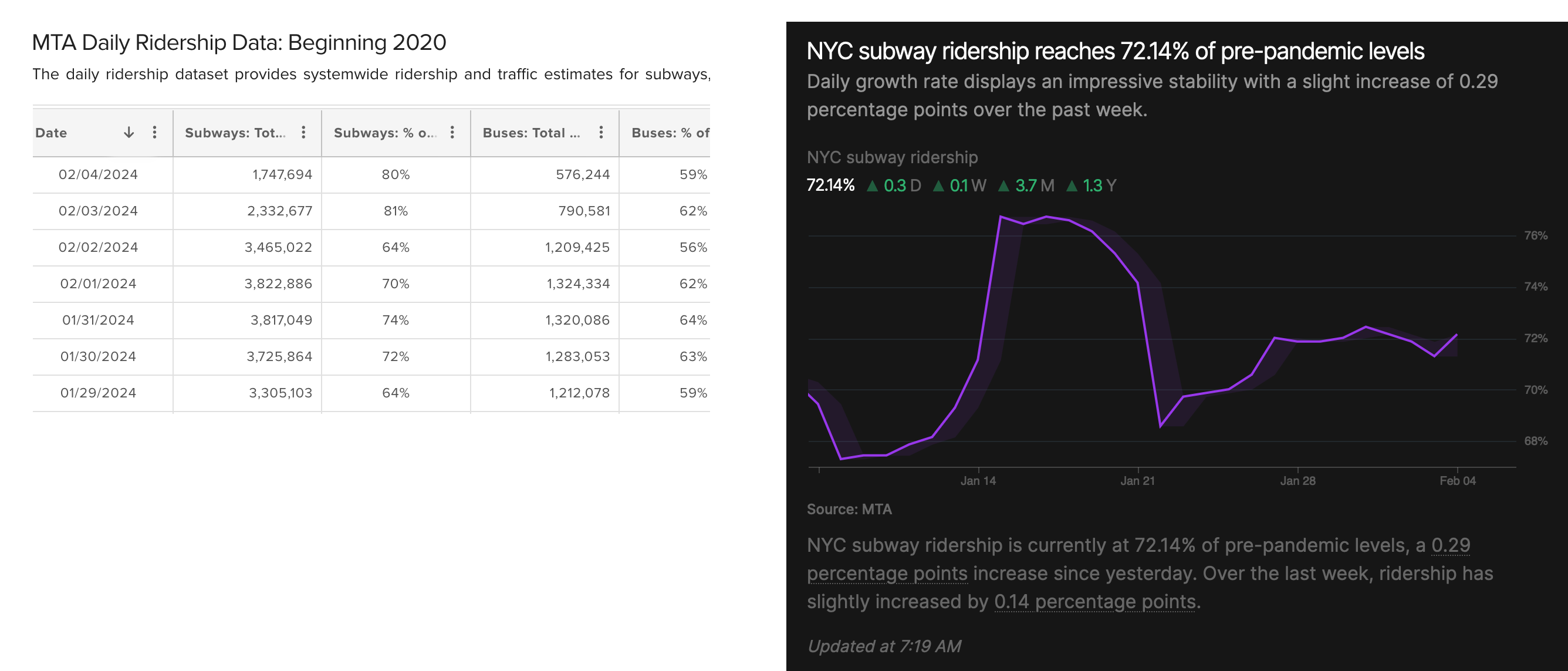
Data also is stored in formats that are hard to read and track, especially when it comes to changes over time. Governments, for example, release reams of information, but often in spreadsheets and PDFs. Checking for new updates means downloading the most recent document, searching for line items with the right data, and then comparing them with previous values to see what’s changed.
By contrast, each Realtime feed is visualized in a dynamic time-series chart accompanied by associated media coverage. See the comparison in Figure 2.
Better access to high-frequency data
Better access to high-frequency data
The world has trended toward speed, but when it comes to high-quality data-driven analysis, there is a major imbalance between the tools which big banks, Fortune 500 companies, governments, and other large organizations have access to—and the ones that an everyday person can afford and easily use.
We offer Realtime as a way to narrow this knowledge gap. Our engine can handle data that update at a range of frequencies—and we’ve sought to prioritize high-frequency data when the accuracy tradeoff to traditional, slower-moving measures is comparatively low. In addition to covering standard-bearing polling indexes, for example, Realtime displays prediction markets1, which update minute-by-minute as people buy and sell shares representing the outcomes they expect to see realized.
Economic forecasts and nowcasts released by the Federal Reserve also fit the bill here. These tools project the present value of GDP and inflation, metrics that are released on a quarterly and monthly basis respectively. They rely in large part on statistical modeling methods that include buckets of higher-frequency macroeconomic data, which also serve as inputs used to calculate the official numbers. Large institutions use forecasts like these to make decisions impacting their bottom line, and they generally have performed well relative to other common benchmarks.
We’re launching with a curated selection of data covering topics like the 2024 U.S. Presidential Election, Global Markets, Electric Vehicles, New York City, and so forth. Our goal is to gradually step back from this role and hear from you, the Realtime Community, on what you’d like to see (or not see) on our platform.
The Realtime engine
The Realtime engine
Identifying meaningful changes
Identifying meaningful changes
Our system scans a range of public data sources and turns them into dynamic charts that make it easier to understand what’s happening within the data. But in this sea of data, how does the Realtime engine choose what to bring to your attention?
We aim to optimize for meaningfulness. Realtime’s “trending” algorithm is simple. It mainly weighs three factors: the size of recent changes in the data; the recency of updates to the data; and the volume of recent news coverage potentially related to the data. Our engine considers whether each of those factors deviate from what we’d expect to see, so they are relative rather than absolute.
The top feeds our engine identifies are elevated in real-time as “trending” and featured on our front page; the top feeds among these over the relevant time frame are included in our daily and weekly newsletters. Stories in our topical reports are ordered using the same method. We’ll continue to calibrate the algorithm as we develop Realtime, but it will always center the data, not impulse or driving clicks.
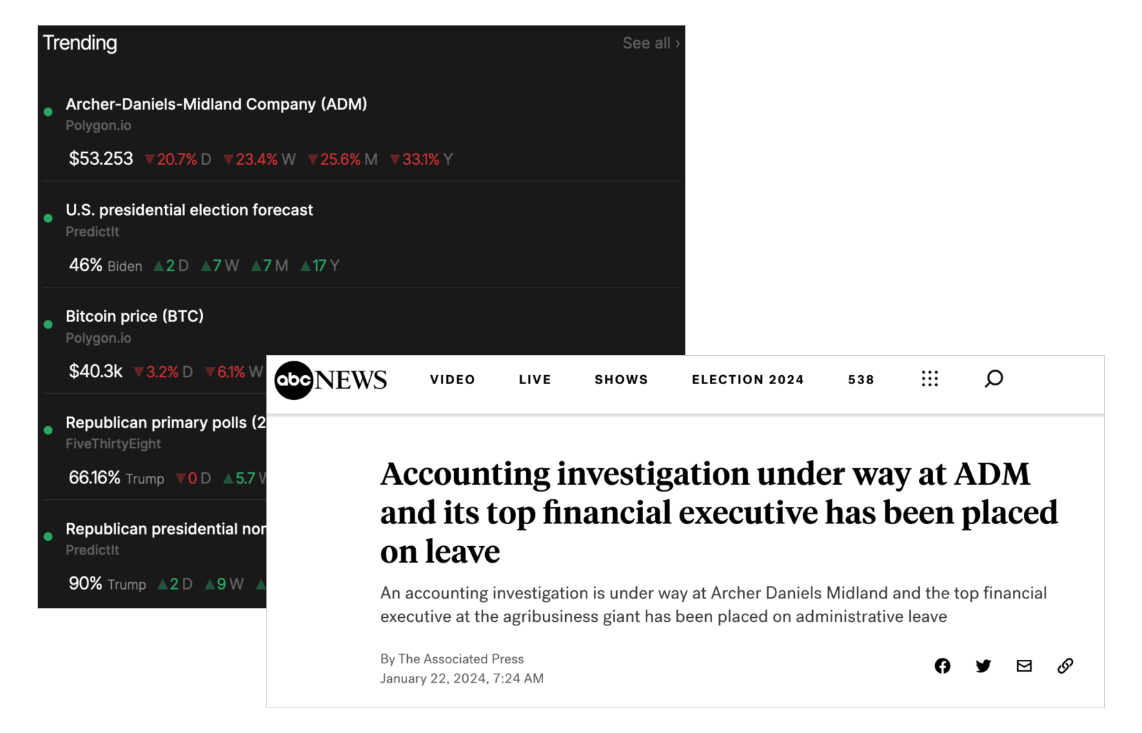
There are a couple of clear advantages of a data-driven ranking of ongoing phenomena. For one, our engine may flag news stories that received comparatively little coverage, or that we scrolled by in our other feeds and notifications. For example, Realtime elevated a major drop in the stock price of one of the largest U.S. companies, leading us to a news story about a major financial scandal there (Figure 3).
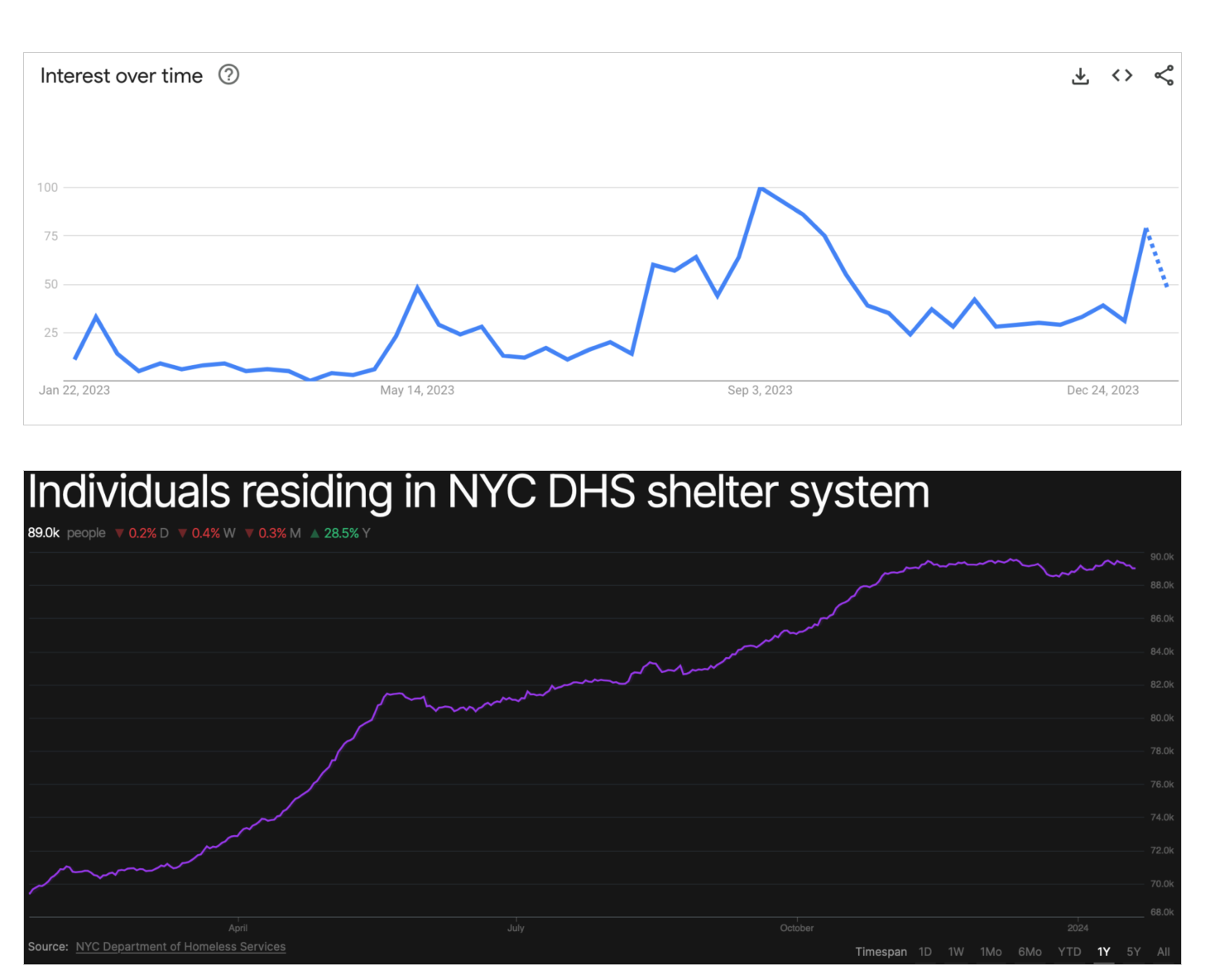
The data may also flag emerging stories that haven’t yet received the amount of attention they deserve. Figure 4 shows an asymmetry between online search interest and the data on people living in New York City homeless shelters.
Being able to identify important trends early can help us be better prepared to address major challenges before they become harder to manage.
Summarizing ever-changing data, with speed and at scale
Summarizing ever-changing data, with speed and at scale
It’s necessary to have context to understand data. Sometimes we already know what we’re looking for: maybe a damaging news story comes out about a candidate for political office, and we navigate to a prediction market to see how it has moved in response. But often, we don’t have this background and can’t fully appreciate what we’re observing.
Consider Figure 5: the chart is presented without supporting text or explanation, leaving the reader to interpret the changes in the data themselves without any relevant context. While this is an improvement over data in a table or PDF, we can do better.
The most ambitious—and correspondingly experimental—goal of the Realtime engine is to scale the ability to provide context quickly. We achieve this by combining basic statistical software with a state-of-the-art large language model (LLM).
We see this work as another step forward in a long line of journalists adapting new technologies and quantitative methods to improve the accuracy and capabilities of their reporting: from adopting social science methods like polling, to real-time modeling of election results, to utilizing satellite imagery and machine learning for investigative reporting.
To make it work, we pass three types of information to the LLM: metadata describing what the data represents, relevant features of the data, and recent related news headlines. The “features” of the data are a kind of statistical summary: things like how much the data has changed over the past day or week, the most likely outcomes in a forecast, and so on.
When a data feed is elevated by our ranking algorithm, the LLM transcribes the changes that it observes, looks for news stories that might be relevant, and briefly describes how the recent stories might relate to shifts in the data.
Figure 6 shows a live example: the current top story on Realtime, as determined by our ranking algorithm. The text and chart will dynamically update as the underlying data or rankings shift.
We take measures to define the behavior of the LLM narrowly, especially when it comes to restricting the inference of causal relationships between the news and data changes. Crucially, the goal isn’t to substitute human analysis or judgment—it’s to direct us to potentially helpful information. While it isn’t perfect, we think the output serves as a useful first draft. We plan to continuously improve this model with feedback from the Realtime Community.
Moving forward
Moving forward
Putting it all together, Realtime is an automated newswire that uses data as a lodestar for navigating a dense and sensational media ecosystem.
The current iteration isn’t perfect2: there are significant challenges to making a project like Realtime function well consistently, especially as we scale. But with help from you, the Realtime Community, we’ll continue to improve our engine—making it more robust and rolling out additional features—to achieve our goals of making timely data more accessible for understanding the world around us.
We envision two main areas of focus for Realtime moving forward. One is increasing the volume and variety of data sources we display. For example, we’re currently working to add data feeds from more major U.S. cities to the platform, but aim to cast a wider net, both globally and within the country, as we build out Realtime.
The second is enabling a more personalized user experience. Currently, you can subscribe to topical “Realtime Reports” that we have curated, but we’ll soon be rolling out custom reports that let you pick and choose more precisely which data feeds you’d like to be updated on. We’ll also be introducing customizable alerts centered around particular data feeds that let you track developments such as volatility, the release of new data, and the crossing of a numerical threshold considering your needs and interests.
Enter Realtime. Subscribe today and join us for the ride!